Guides
Primary Logo Use
The icon portion of our primary logotype is set in Effra bold, and the rest of the logotype in Effra Medium which helps to visually balance the weight of the logo.
The UDisc icon is to be used in place of our logo as a seal or emblem when the brand has already been established.


Our primary logotype should be used on appropriately contrasted backgrounds. The flight path/latter portion of the logo may be inverted to white for situations when a darker background is utilized.
Alternative Use Cases


Our primary logotype and icon may be converted to one color for use on our primary color backgrounds in addition to any situation where the orange “U” is not appropriate (i.e. alternate brand colors overlays on photography, or situations where light and dark modes are used).
Avoid These Logo Treatments

Please do not deconstruct the logo

Please do not rotate the logo

Please do not stretch the logo

Please do not use a gradient

Please do not use colors outside of the brand palette

Please do not fill the logo

Please do not rearrange or stack the logo

Please do not put the logo in containers
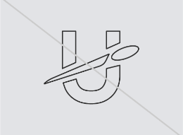
Please do not outline the logo

Please do not use effects on the logo
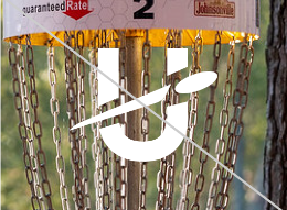
Please do use the logo on hectic, low contrast backgrounds

Please do not use the old logo
